


Cover Reveal: BAD CHOICES MAKE GOOD STORIES
- Mar 29, 2021
- 3 min read
Updated: Mar 31, 2021
I'm so excited to show you the cover for Bad Choices Make Good Stories: Conversations About Writing.

My friend and critique group member, Gary Crespo, worked with me and designed it. The process for this was completely different from how I've experienced cover designs through my traditionally published books, so I thought I'd share the steps we took to make the Bad Choices cover. Read on if you want to find out more!
When I work with my traditional publishers on covers, I don't have a lot of input. The in-house designers (all of whom have done an amazing job with my books!) do mock-ups and work with the editors and art directors to refine and make tweaks. Sometimes I'd get to see more than one design, but frequently I would get an email with my cover JPG attached, and there would be a few tweaks here and there before it was finalized. I've loved all of the covers on my novels and picture books, and I have absolutely zero design skills, so this part of the indie-publishing journey was the most foreign to me.
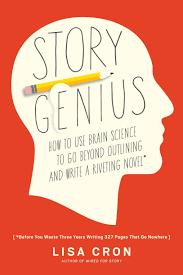
I started by looking at the covers of craft books that I've enjoyed and were fairly recently published. I particularly enjoy the look of Lisa Cron's Story Genius and Matthew Salesses's Craft in the Real World. Both of these covers have bold backgrounds, simple designs, and consistent type treatment.


I decided to take a look at Shutterstock.com, where you can purchase stock images that you can alter to fit your project. I searched for "writing" and about a squillion images came up. I quickly eliminated anything that was photo-based and decided to go for an illustration. I like the color blue, and I scrolled through until I found this guy:

This is pretty much what my writing space looks like, only instead of an address book, I have my project notebook open and ready.
But I also knew it would be too busy for a cover. I sent Gary the images, and we met to discuss what I wanted. He was able to alter the image (which is OK by the terms in Shutterstock's usage agreement) and sent me seven different cover designs, which we narrowed down to two. As you can see, he took out the background design, the glasses, the phone, and the address book. Those changes made it look much more clean to my eye--and still an accurate representation for what it looks like when I'm editing.
We talked a lot about color, too, and decided to pull the color of the pencil and the pen for the bands at the top and bottom of the cover. Although Cron and Salesses's books are a solid background, I felt that the teal was just a little too bright for the whole cover. I liked the simple font choice and kept it sans serif to match my "model" book covers.
Lastly, Bad Choices Make Good Stories has a different vibe from those other two books. My book is a conversational approach, and covers the gamut of the writing life--from craft, to revision, to community, to balancing the life elements that come with writing and working and having a family. It's less formal, more casual.
Working with Gary was a lot of fun, and I hope you find the cover eye-catching and the book helpful! The ebook is up for preorder on Amazon and Barnes and Noble, and will soon be on Apple Books, Kobo, and Google. Gary and I are tackling the spine and back cover for the paperback this week, so stay tuned!
Comments